
Junkies


Case Study
“One man’s trash is another man's treasure”
At its core, this project embodied that old adage. I’ve always been a huge proponent of the idea of making something out of nothing, or in this case taking something people have negative associations with, like junk mail, and turning it into something fun and engaging. Also loving word play, what better to juxtapose with junk mail than junk food? The show became a celebration of the food with love on the mail we hate.
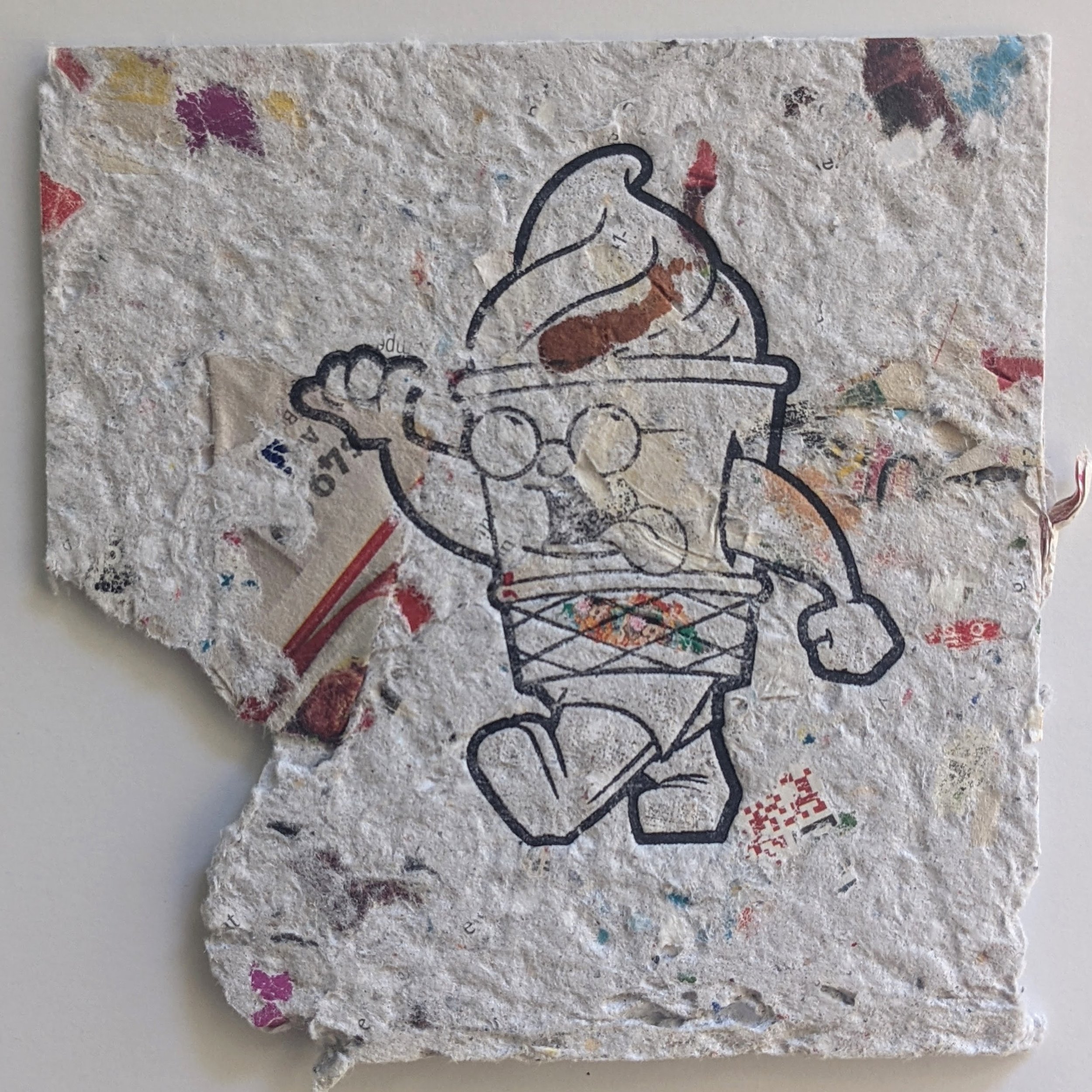
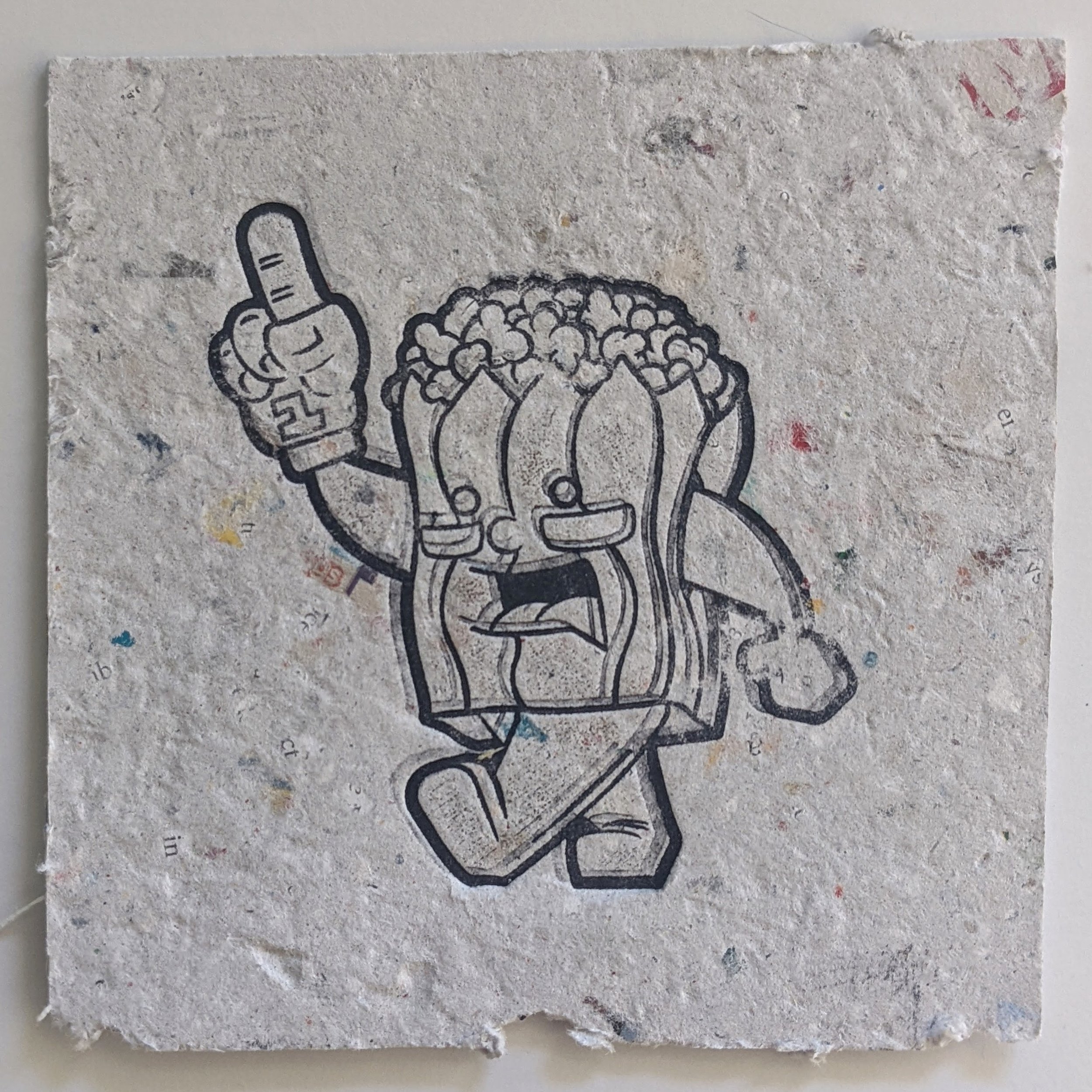
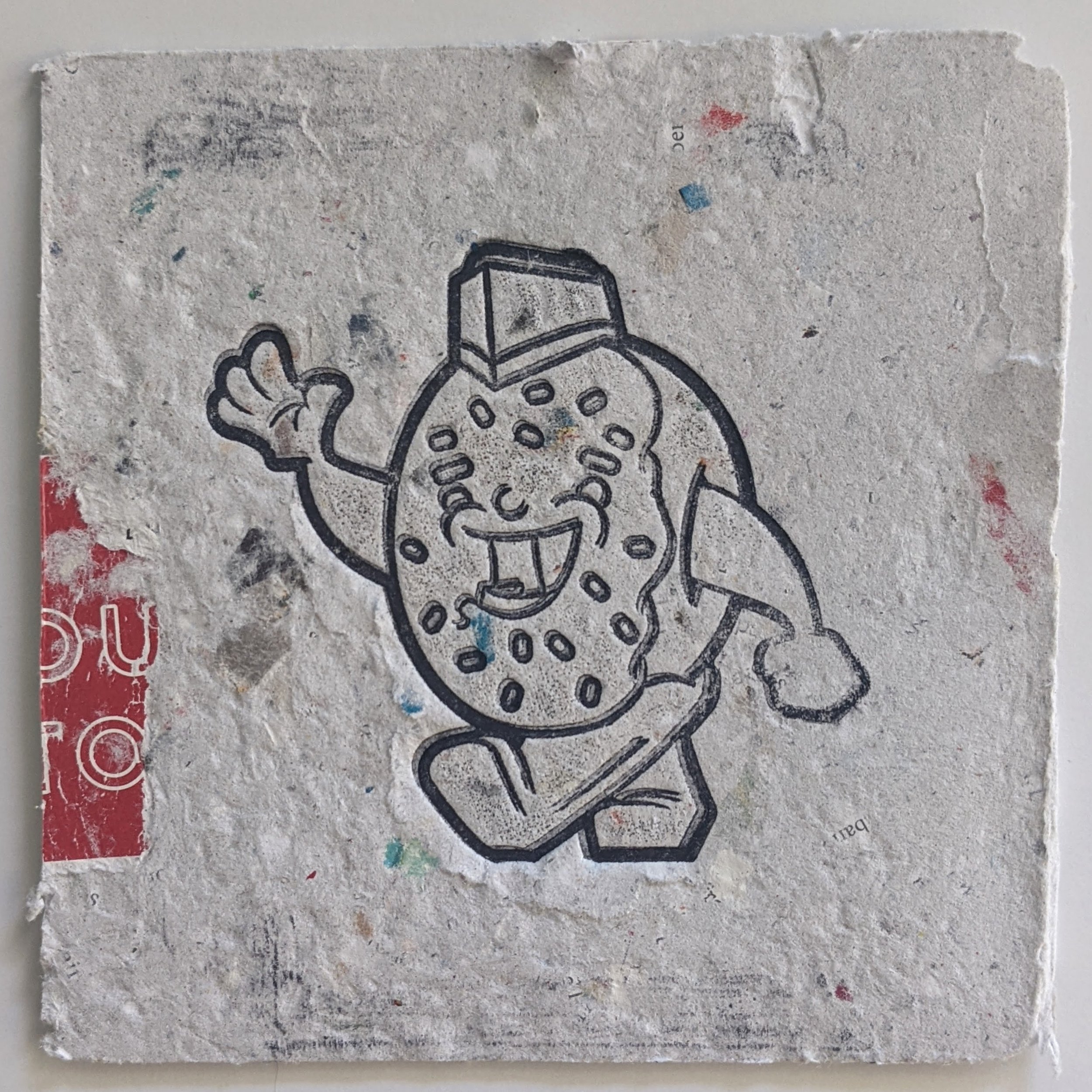
Beyond the initial concept, I knew when creating the 13 characters I wanted to see how far I could push the same basic form to create unique personalities on the same frame. To the same effect that Warhol would overuse an image until the audience was desensitized to it, I wanted the body of the characters to fade into the background so the focus was on the small details that made them unique. The chain on the granny’s glasses, the cheese tie on the hamburger or even the full scope of toppings piled into the Chicago hot dog. Each character shares characteristics, but stands on their own and has a distinct personality despite the repetition of their poses.
Making Paper


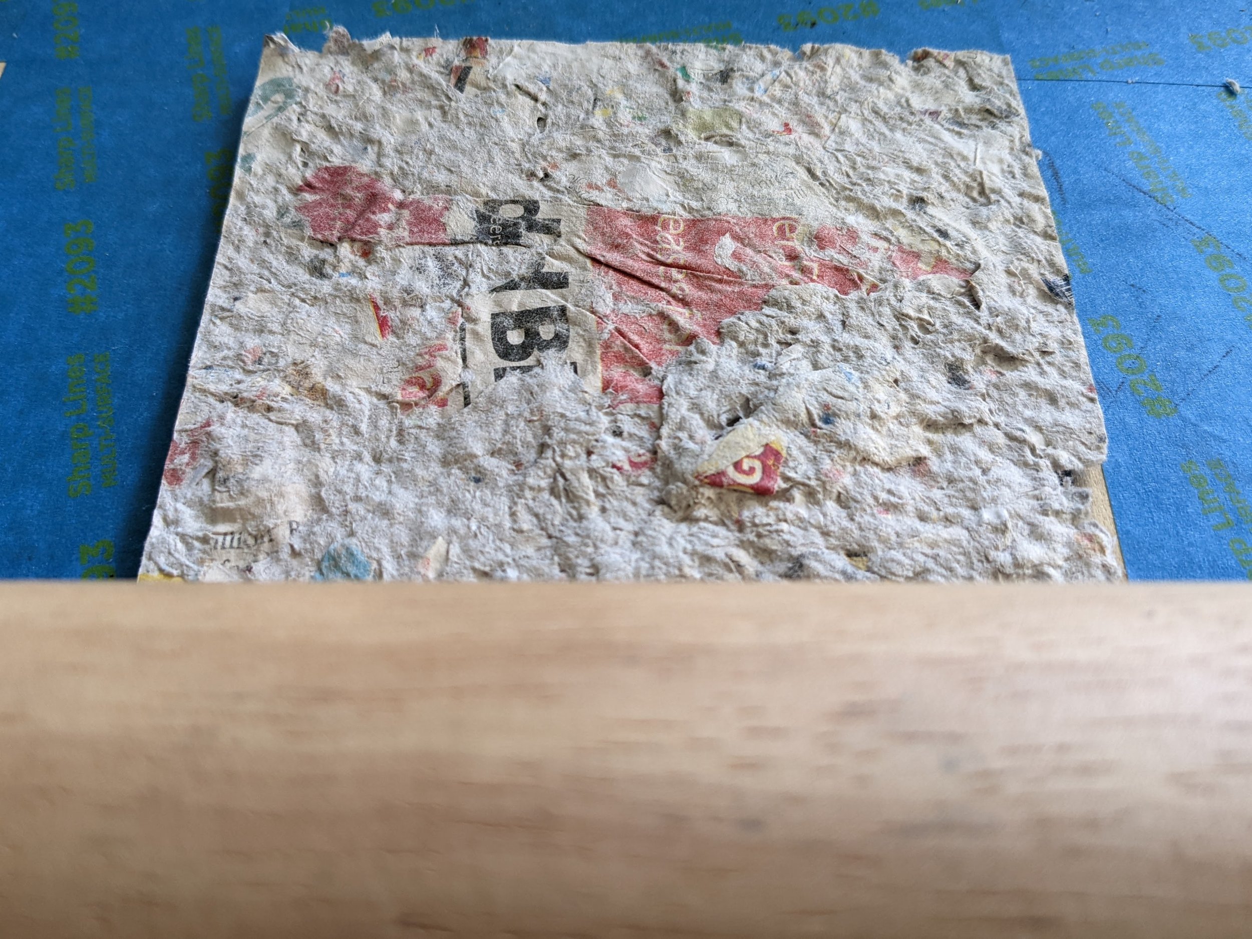
The whole project was dependent on me figuring out how to make my own paper pulp and the best way to print the characters on the final product. Over the course of a couple months I collected all the local advertisements, credit card pre-approvals and offers to extend my vehicles warranty and built a sizable collection of junk mail to blend into my own pulp. I bought a cheap blender from my favorite big-box store and started playing with different mixtures of paper. The first couple of trials were about getting the ratio of colorful ads to stock white letters right. Too many ads in the blender would turn the paper gray and make it hard to add color to the prints later, but not enough ads would mean there was no junky texture to the pieces.
Ultimately I landed on blending all the white paper together first for a longer period of time, allowing for a finer mush that would act as a great base. After that I blended a mixture of mostly ads at a pulse or burst so a lot of the words, images and pricing would stay intact. This helped create that quickly identifiable junk mail texture while still giving plenty of negative space for the characters to be identifiable on. The two combinations were poured into a giant 5 gallon brew kettle and gently mixed to create a pulp I could then form into flat sheets.
Now that I had a sloppy paper base, I needed to actually make paper. For that I had a bunch of silk screen printing frames laying around that would be perfect for the job. The mesh allowed water to escape and air to flow over both sides for even drying. The first few attempts I just poured my junky concoction on the screen and tried to evenly cover the screen; the only problem, the paper dried pretty thick and would be difficult for framing or just to stay intact. The first few sheets were light and fluffy, like a pastry, and pulled apart about as easy. For subsequent tests I would try applying pressure to the screens, landing on a technique where I placed a towel over the pour and pressed any excess water out. This helped compress the paper so it was stronger and thinner, but also cut down on drying times so I could experiment more with paper mixtures.


Printing
While working on the paper I had to start figuring out what I was going to do to print the characters on it. My initial thoughts were to see if I could digitally print them, but after talking with my local printer it didn’t seem possible. The more I thought about it, the more it didn’t feel genuine to the project either. By the time I had perfected the paper I decided the best way to move forward would be a block print or stamp for the line art and then color them by hand afterward. This too had some trial and error. The first iteration I was worried about the depth of the stamp, so I cut out the lineart and tried to assemble it. Although I got close, it was going to be very difficult to perfectly match up all the pieces, especially when it came to details like the poppy seeds on the hot dogs bun.


Another fun experiment was actually trying to fill the character frame with colored paper, let it dry, reassemble it on a screen and do a second pour over that. Needless to say, they did not work, but it was an interesting approach to the problem that had potential.


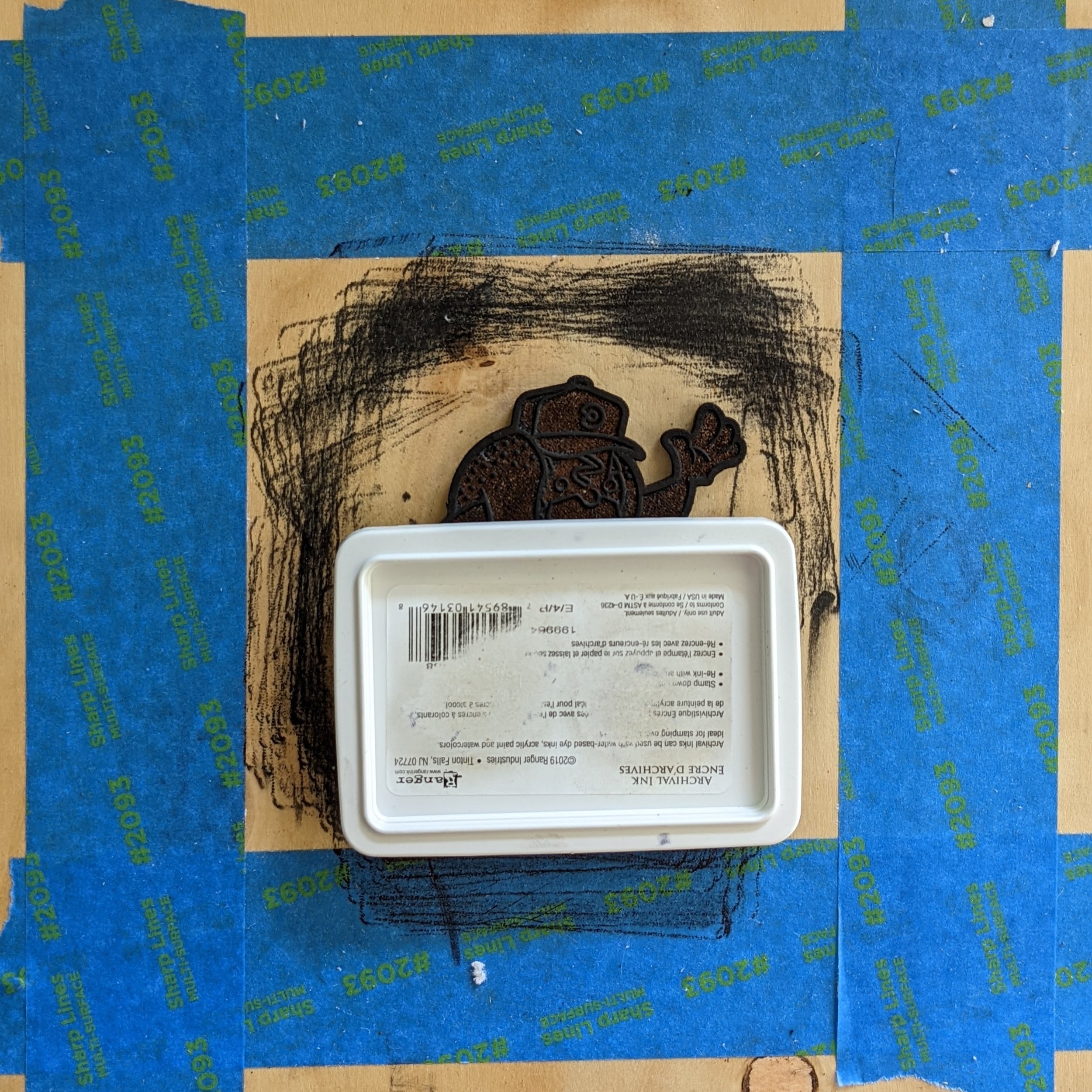
After a couple less than stellar options I simplified the process and went back to a traditional wood block stamp. Instead of cutting the lines out, I just carved (or laser engraved) the wood stamps. It didn’t have the depth that cutting the lineart had, but in the end I didn’t need it. The stamps were easier to produce, took a little more time but had a far better end result.


Now that I had the paper and the printing technique figured out, it was time to refine how I was going to press the characters into my junk paper. My first pass at block printing didn’t yield the results I was hoping for. I picked up some black speedball ink and started coating my stamps and pressing them into some test paper. I’m not sure if it was my inexperience with the ink or the materials I was using, but the prints looked blotchy and lacked the crispness I was looking for. My next thought was to use an archival ink pad and apply even pressure over the stamp. With the block prints only being about 3 inches x 3 inches, I could press firmly over them evenly with a 4 inch baren, or so I thought. The archival pad was great, and allowed me to restrict the amount of ink on the stamps much better, but I wasn’t able to apply enough pressure to get an even transfer on the paper. In a desperate attempt to try and fill the areas that were lost, I tried to realign and hit the stamps twice, but this often resulted in an echoed print instead of a second coat over what was already present. To solve for the uneven printing I pulled a rolling pin out of my kitchen and started to press slowly roll over the pieces. I inadvertently made a lofi etching press and this gave me exactly what I was looking for, a nice crisp transfer and no faded or missed areas. With a solid playlist and the kids in bed I was able to knock out most of the printing in a few nights.
Speedball results

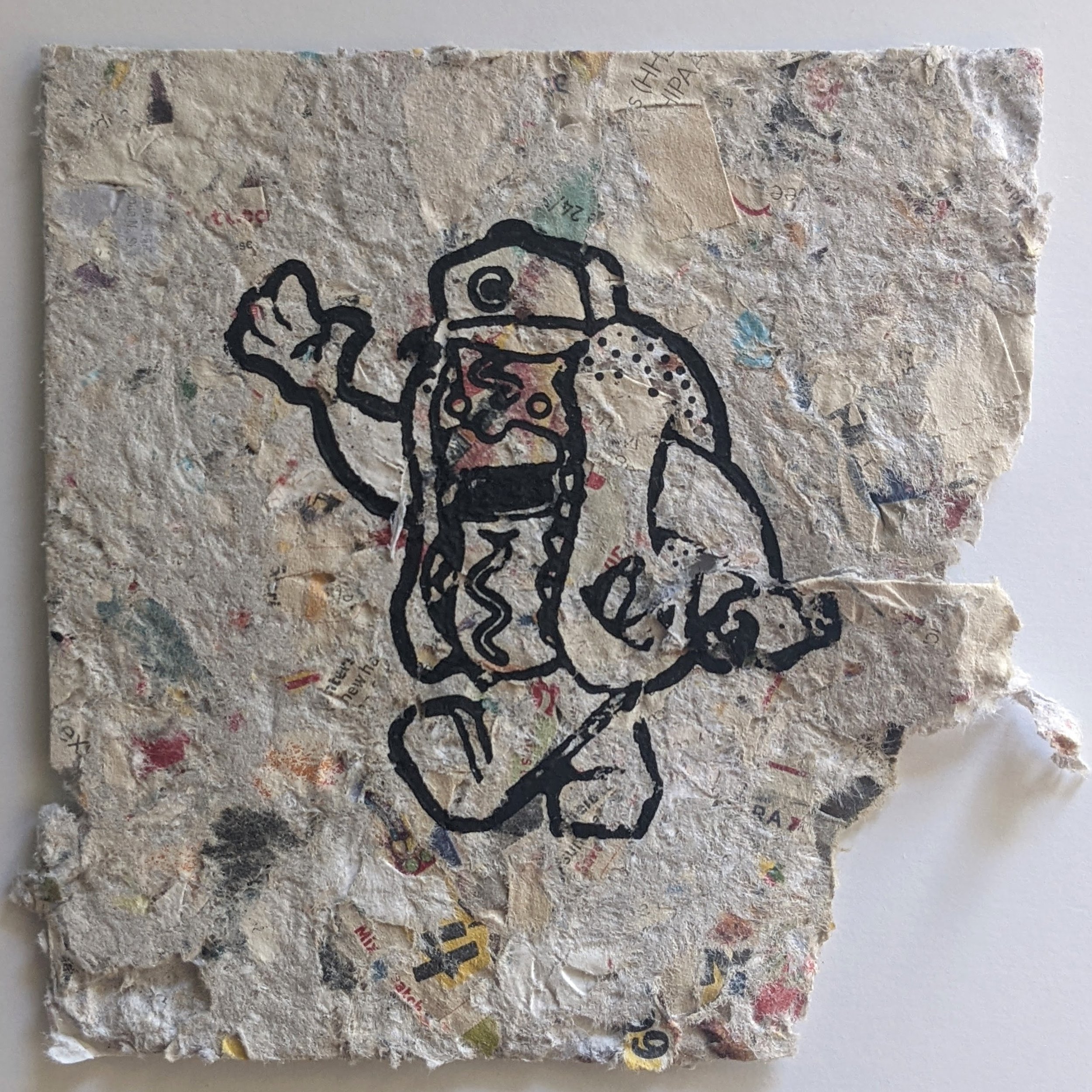
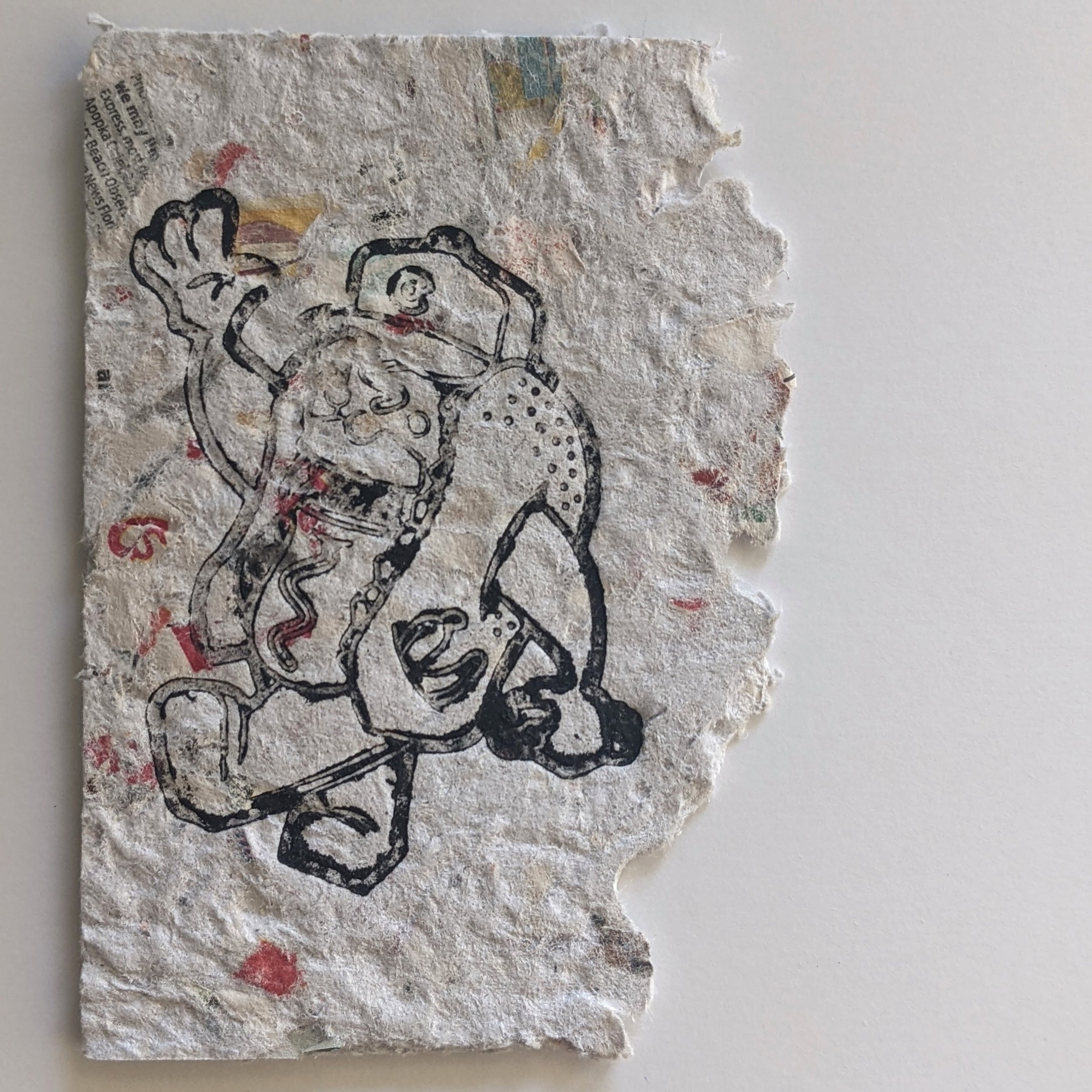
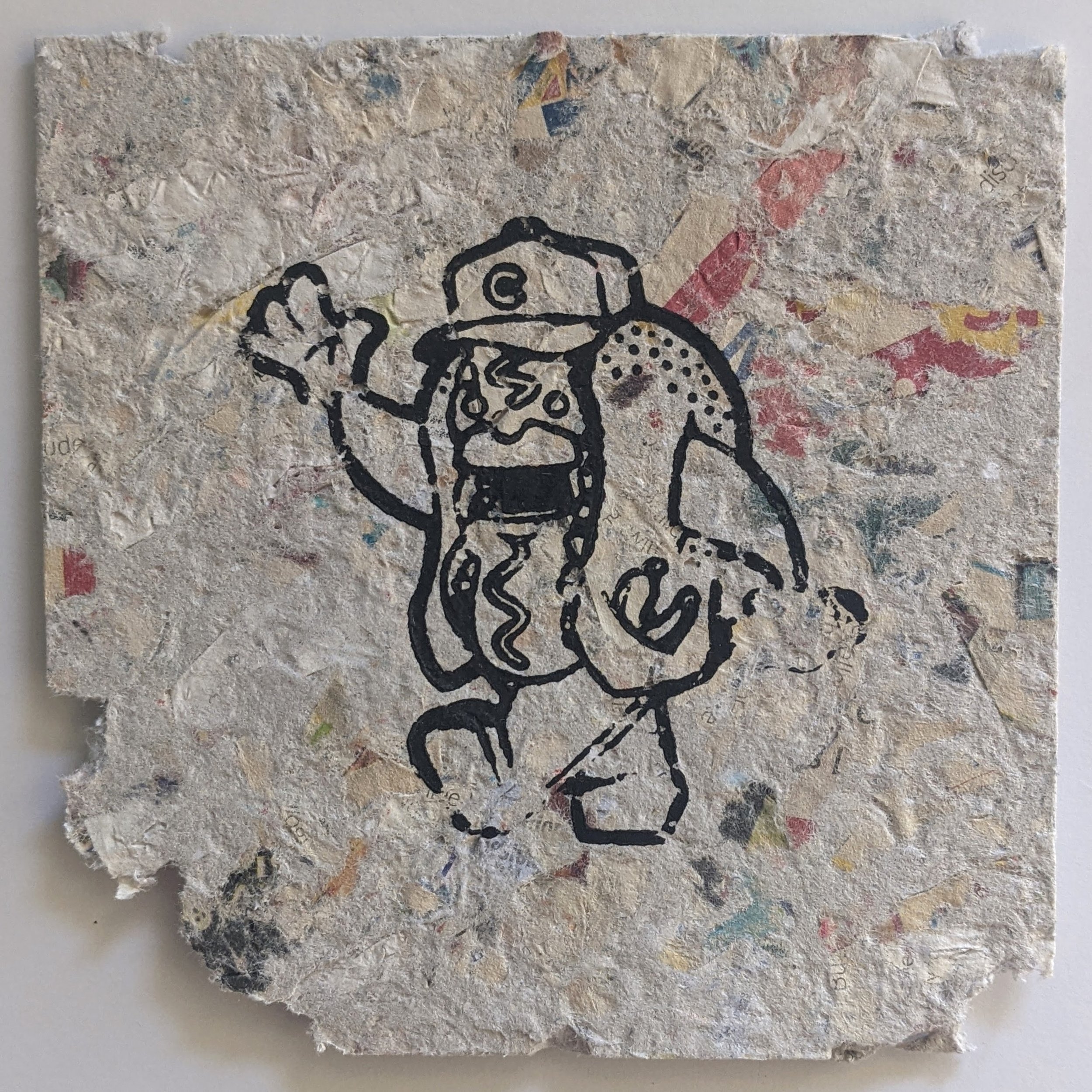
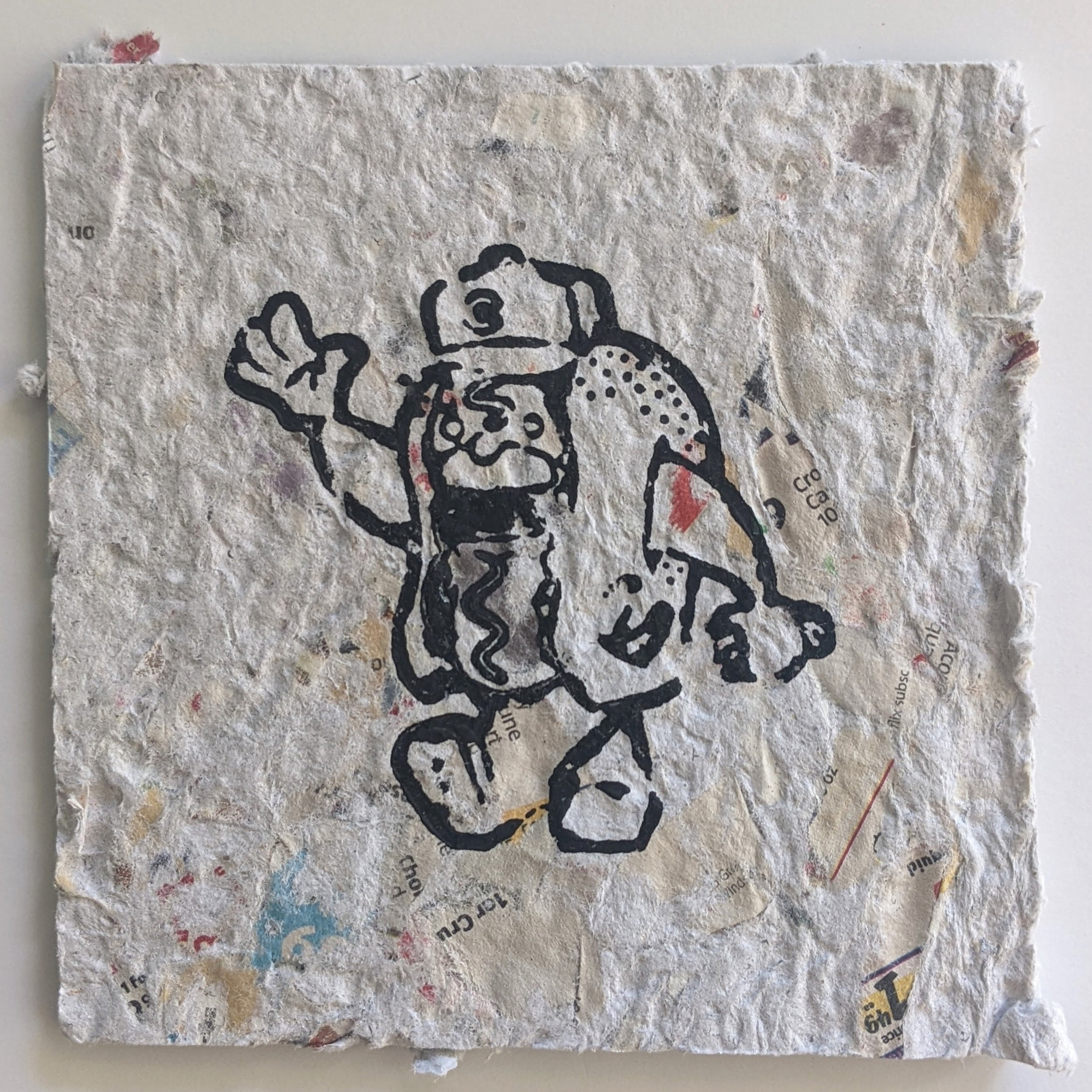
Archival Stamp and Baren Press results

Archival Stamp and Lofi Etching Press results

When it came to coloring the junk pieces, I had a few options. My initial tests I used some cheap watercolors and was happy with the result, but that’s when I thought the pieces were going to be much bigger and I wanted to cover more area at a faster rate. After reducing them down to 5”x5” prints, the water color became a little more unruly. I appreciated the anarchy of the spread when the prints were large and I could control the boundaries easier, but once I started working with smaller details the watercolor proved too difficult to contain and started to bleed over into unwanted areas. After floating the idea of watercolor, I settled on using some artist markers and coloring them in myself. Even with the precision of the markers, I still had to sacrifice some of the details on the characters such as the cops swish and the pretzels bavarian pattern. If I had to do it again, I would make sure anything being colored was either solid black or had an outline to contain the color. In the end I was still very happy with how the junk pieces turned out.


The Show
The venue for the show was one of my favorite spots in Jacksonville, a place called The Mini Bar. The location specializes in small handcrafted donuts and serves coffee and beer, so it was the perfect location to host an exhibit about junk food. For the promotional piece I developed a flier and printed it on wax paper, the kind you find wrapped around a hamburger, hot dog or any other handheld food. Beyond just serving as a promo, the piece acted as packaging for purchase and part of the display for the junk pieces. The final display for each character was assembled with a high end print, a junk print housed in a paper tray with a wrapper and a nutritional fact chart with information on the character.


